
Project Description
Case Study
ITM Rentals – UX Redesign
Redesigning a ‘site-within-a-site’ to modernize layout, improve navigation, and boost clarity for equipment rentals

Overview
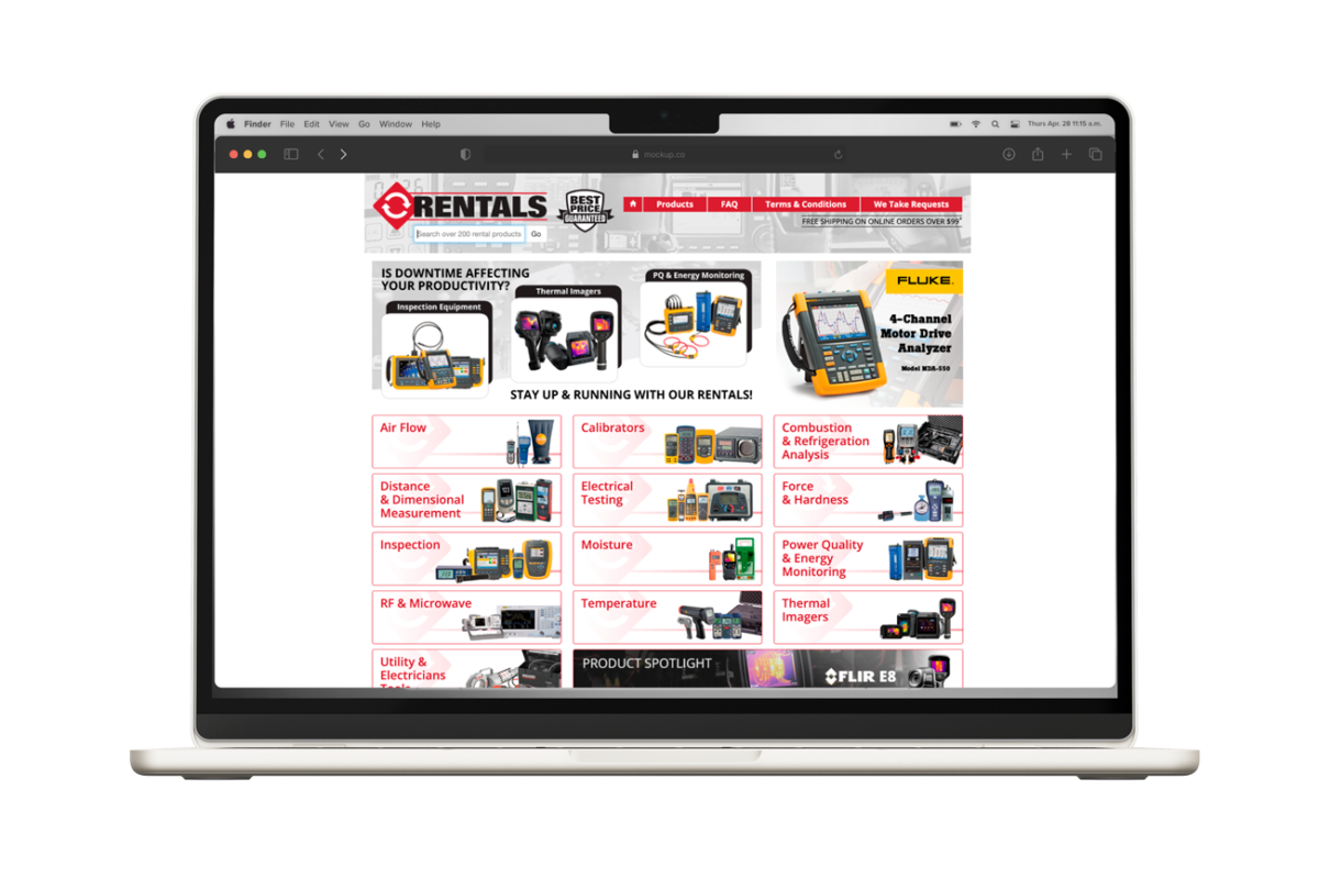
ITM Instruments is a Canadian supplier of professional test and measurement equipment. One of their core services — equipment rentals — was buried in an outdated layout and overwhelmed users with a cluttered experience.
The Rentals section is treated as a “site within a site”: it shares the main ITM navigation but has its own content, purpose, and flow. I was tasked with redesigning the Rentals homepage to better serve users and align with ITM’s business goals.
The Problem
- Visually outdated and not aligned with modern UX expectations.
- Difficult to understand what ITM Rentals offers at a glance.
- Poor visual hierarchy and content overload
- No clear path to take action (e.g. browse, order, contact).
- Confusing structure with overlapping navigation elements.
Goals
- Modernize the design while preserving the ITM Rentals brand
- Improve content clarity through better structure, icons, and microcopy
- Introduce a dedicated Rentals navigation without disrupting the parent site
- Create an experience that feels trustworthy, scannable, and actionable
- Use UX methodologies (competitive research, user flow analysis) to guide the redesign
UX Process
Competitive Research
I audited rental platforms across the industry to identify patterns in navigation, layout, and trust-building strategies. This helped define how categories, value propositions, and actions should be structured.
Content & Layout Strategy
To improve clarity and flow, I restructured the page into a storytelling layout:
- Welcome
- Why Rent With Us
- How It Works
- Product Categories
- Best Price Guarantee
- Featured Products
Each section is concise, visually supported, and designed to guide users from awareness to action.
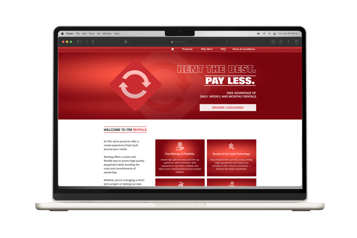
The previous design was constrained to a narrow-width layout. I introduced a full-width hero section and widened other key content areas, creating more visual breathing room and improving scannability.
Navigation Redesign
The original Rentals page had limited navigation options. I introduced a mega menu under the ‘Products’ dropdown, allowing users to view up to three levels of subcategories at a glance. This improved access to deep product types and streamlined the browsing experience.
Additionally, I implemented a distinct Rentals sub-navigation (Products, Why Rent, FAQ, Terms), reinforcing the “site-within-a-site” architecture while maintaining consistency with the main ITM website.
Visual & Interactive Enhancements
- Designed a clear, modern hero with a bold value statement and CTA
- Introduced icon-based product categories for better scan-ability
- Built an interactive “How It Works” section: each step becomes visible as the user scrolls, adding a sense of progression and motion
- Maintained brand consistency using ITM’s color scheme (red, black, grey) and typography
Final Outcome
The redesigned ITM Rentals page successfully transforms a once outdated and cluttered interface into a modern, user-focused experience that aligns with both business objectives and user expectations.
From a visual and structural standpoint, the shift to a full-width layout allowed the design to breathe, making space for large visuals, clear calls to action, and a hierarchy that guides users naturally through the content. Each section was purposefully crafted to reflect a narrative experience — beginning with a bold value proposition, then moving through trust-building content, and finally leading users toward specific actions such as browsing categories or placing an order.
A major structural improvement was the addition of a mega menu under the “Products” dropdown, which introduced a much-needed third level of categorization. This addressed a real usability issue in the original layout, where navigating to niche product types was confusing and time-consuming. The new menu makes it easy for users to scan, discover, and reach their destination with fewer clicks.
Another highlight is the scroll-activated “How It Works” section, which adds a layer of interactivity and rhythm to the browsing experience. Instead of overwhelming the user with static instructions, the page now reveals each step progressively — creating a feeling of motion and clarity. This subtle dynamic element not only enhances the UX but also helps communicate a fairly complex process in a digestible, engaging way.
Throughout the project, I balanced business branding requirements with modern UX principles — ensuring that all visual and interactive improvements felt on-brand, familiar, and trustworthy. The use of color, typography, and iconography was carefully managed to align with ITM’s identity while improving usability.
Overall, this project was a deep dive into designing within constraints — updating legacy infrastructure, honoring existing brand elements, and working with a dense product catalog — all while delivering a clean, usable, and professional interface tailored to industrial users.


