
Project Description
Case Study
MapleSwift
MapleSwift, a mobile application designed for international money transfers, powered by MapleBank, sought to optimize user experience to streamline the process of sending money across borders. This case study delves into the challenges faced, strategies employed, and outcomes achieved in creating brand new application.

Timeline
Three weeks, from May to June 2024.
Type
The team project completed during the Concordia University UX Design course offered students a hands-on opportunity to apply theoretical knowledge to real-world design challenges, gaining practical experience in research, ideation, prototyping, and presentation skills.
Responsibilities
I teamed up with two other UX Design peers who have different background, such as Marketing and Programming. We all worked on:
- Conducting user research to understand user needs, pain points, and behaviors related to international money transfers.
- Choosing user personas and developing user journey maps to guide design decisions.
- Creating wireframes, prototypes, and mockups to visualize and communicate design concepts.
- Conducting usability testing to gather feedback and iterating on designs for optimal user experience.
My Role
We, as a team, identified our strengths and skillsets that could be beneficial for this project and devided some roles and responsibilities. My role was:
- Creating the design for main components, such as buttons, text fields, notification modals, popup windows etc.;
- Creating the layout of most of the pages;
- Developing the MapleSwift logo;
- Creating a branding guide
- Creating several flows for the money sending process
Problem
MapleBank, a fully online bank with no physical branches in Canada, is rapidly gaining traction and is now poised to expand its market presence across the country. With a focus on breaking into new markets, they seek to offer products that cater to various needs within these markets, addressing critical financial concerns of their user base.
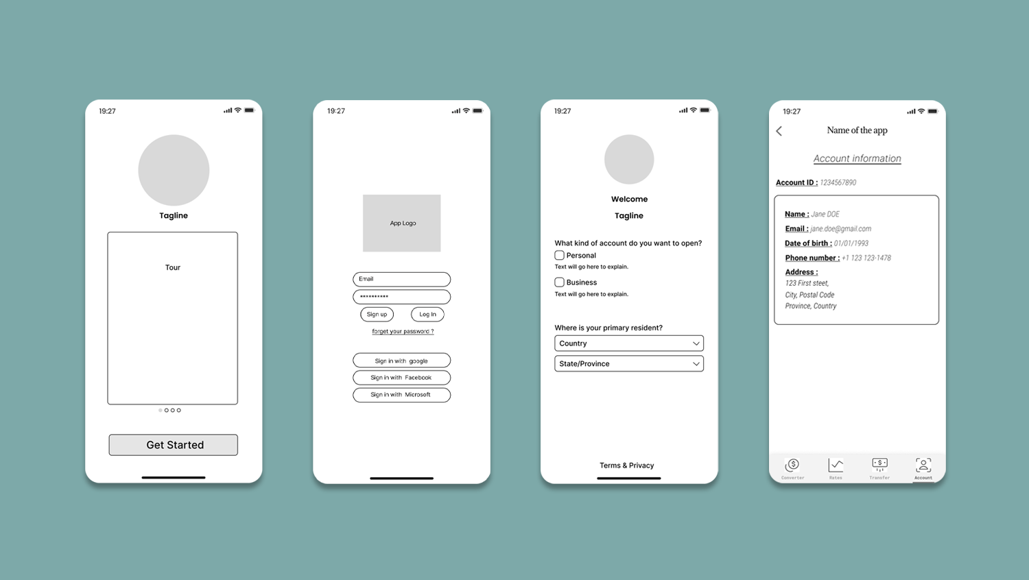
The CIO’s specific requirement was that the service target individuals who are not currently customers of the bank. This necessitated the development of an onboarding flow for the app that clearly elucidates the new service and features user-friendly registration forms. Additionally, the CIO emphasized the importance of ensuring that the new product serves only one purpose at a time, whether it’s “applying for a mortgage” or “donating money to a cause.” The objective is to create a straightforward product that is immediately understandable and beneficial to the new market.
Solution

Research Findings
Statistics
According to Statistics Canada, over 8 million immigrants reside in the country, constituting approximately 22% of the population. This demographic represents a significant user base for our international money transfer app.
The World Bank reports that Canadians sent over CAD 30 billion in remittances abroad in 2022. These users face high fees, slow transfer times, and complex processes with traditional services, highlighting the need for a user-friendly, cost-effective digital solution.
This comprehensive analysis underscores the potential of our app to serve this significant and tech-savvy demographic effectively.
Competitor Research
In the competitive landscape of international money transfer services, key players like Western Union, MoneyGram, and PayPal’s Xoom dominate the market with widespread network coverage and established trust. However, they often charge high fees and have slow transfer times, which are major pain points for users.
Emerging digital-first competitors like Wise (formerly TransferWise) and Remitly are gaining traction by offering lower fees and faster transfers, but they still face challenges related to user experience and service accessibility.
This competitive analysis highlights opportunities for our app to differentiate itself by providing a more user-friendly, cost-effective, and efficient solution, tailored specifically for the tech-savvy immigrant population in Canada.
Persona
Key facts provided by the MapleBank CEO:
- 80% between 18-30 years old
- $65k+ average household income
- 66% identify as male
- 75% rely on the phone app for checking balance
- 62% rely on the phone app for transferring money
- 21% have tried mortgage pre-approval on mobile site
- 33% switch banks when they want to invest $100k or more
- 47% have no investments with us
- 58% have no insurance with us
- 64% said they are likely to open their kids accounts with us
The MapleBank CEO also received a list of potential new customer personas. Based on the provided data, our team developed two primary personas.
Primary Persona

Secondary Persona

Ideation
Once the product was established and the analysis was completed, we began the ideation process. We broke the project down into parts and assigned specific tasks to each team member to build our low-fidelity wireframes. We then combined the best elements from these wireframes into a unified low-fidelity version. This was subsequently upgraded to a mid-fidelity wireframe, with a focus on locking in the user flow. This collaborative approach ensured that each aspect of the app was carefully considered and refined to meet the needs of our target users.

Low-Fi Wireframe
The low-fidelity wireframes for our international money transfer app featured simplified visuals to outline the core layout and essential user interactions, focusing on the primary functionalities without detailed design elements.

User Flow of Sending Process
The visual representation of the user flow for the money-sending process depicted a streamlined sequence of steps, from entering recipient details to confirming the transaction, ensuring a smooth and intuitive experience for users.

User Testing
We conducted extensive user testing to refine our international money transfer app, focusing on usability and user experience. Collaborative sessions provided valuable insights from different viewpoints, allowing us to gather diverse perspectives on the app’s functionality and design. Constructive comments pointed out areas for improvement and overlooked details, which were crucial in enhancing the overall user experience. Positive feedback strengthened our confidence in certain design elements, confirming that key features resonated well with our target audience. This iterative process of testing and feedback ensured that the final product was intuitive, efficient, and user-friendly.
First page of sending money process
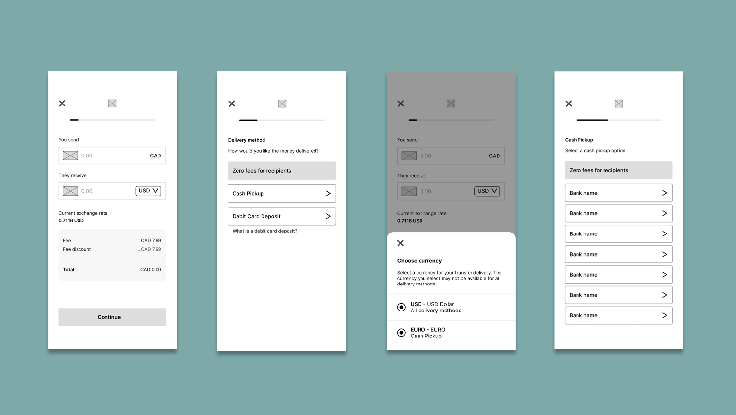
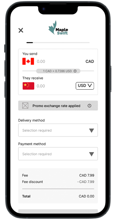
User feedback highlighted that the initial page of the money-sending process was overloaded and not very intuitive. To address this, we simplified the starting page by relocating the delivery and payment options to the next step. Additionally, promotional information was moved to the confirmation page at the end of the process. The header was updated, replacing the “close” button with a “back” arrow to enhance navigation, and a navigation bar was also added for easier access to key features. These changes resulted in a cleaner, more user-friendly interface that aligns with user preferences and improves the overall experience.
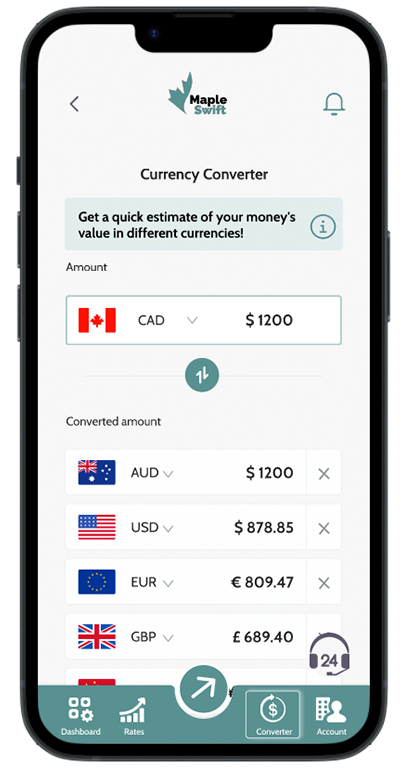
Currency Converter page
This page generated the most user confusion, with unclear functionality and a confusing currency converter. We completely reworked the page to address these issues. A small information box was added, providing a brief note that helps users understand how the converter works.
We visually separated the sender’s currency to make it clear and removed the “favorite” icons, replacing them with a close button next to each currency for easy removal. Feedback indicated that the nav bar icons were too thin, so we updated the nav bar design for better visibility. Additionally, the plus sign was replaced with a button labeled “Add Currency” to ensure its purpose was clear and maintain consistency throughout the interface.

Scalable Design System
To ensure consistency and efficiency across our money transfer app, we developed a scalable design system. This system includes a comprehensive set of components, such as buttons, forms, and navigation bars, all designed to be reusable and adaptable. We established a cohesive style guide that covers typography, color schemes, and iconography, ensuring a unified look and feel throughout the app.
By creating these standardized elements, we facilitated faster development cycles and easier maintenance, while also providing a consistent user experience across different platforms and devices.
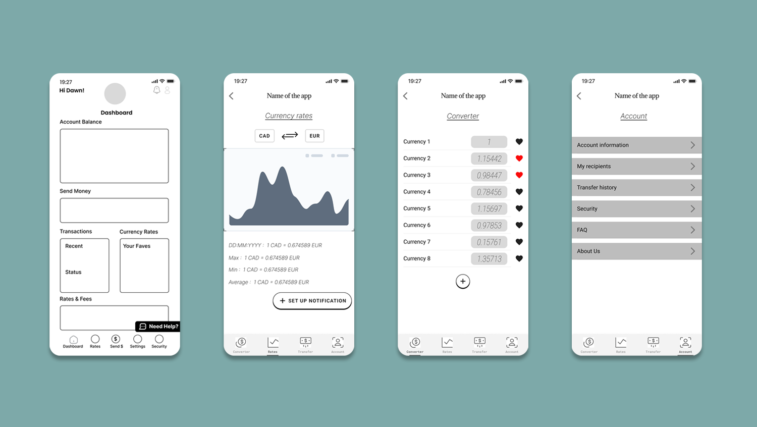
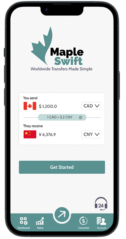
Final Design
The final design of our international money transfer app is the result of meticulous research, thoughtful user feedback, and iterative refinement. Our goal was to create an interface that is both aesthetically pleasing and highly functional, ensuring a seamless user experience from start to finish.
Key features of the design include a streamlined money transfer process that guides users step-by-step, making it easy for even first-time users to complete transactions with confidence. We placed a strong emphasis on clarity and simplicity, removing any elements that could cause confusion and ensuring that essential actions and information are always prominently displayed.
We integrated several key features that some competitors offer separately into a single app. These include up-to-date exchange rate information directly integrated into the transfer process, a cash pick-up option without the necessity of opening a bank account or having a debit/credit card, and alerts that notify users when a specific currency rate falls below a specified level. All of this allows users to make informed decisions without leaving the app.
The final product is designed to be scalable, allowing for future enhancements and features without compromising the user experience. Our app stands out in the market for its user-centric design, making international money transfers as simple and stress-free as possible. You can test the final high-fidelity prototype below. Press ‘F’ on your keyboard or click the maximize icon in the top right corner of the frame to enter full-screen mode. To reset the user flow, press ‘R’.

